


Corsair K55 Core Keyboard Review

K55 Core Up Close
K55 Core Up Close
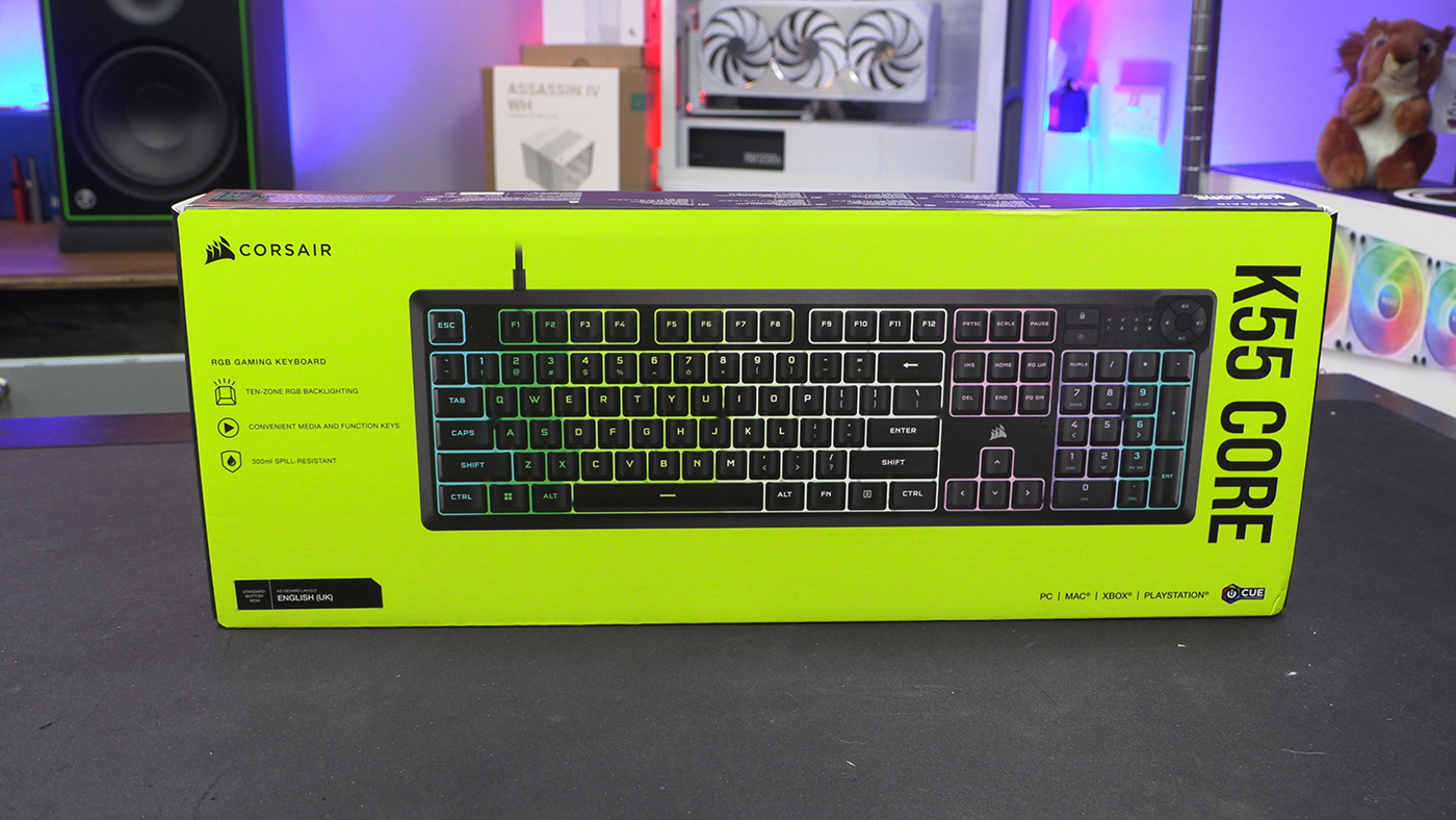
There is never any doubt that you’ll spot a Corsair product easily. The lurid yellow packaging just grabs the attention. You certainly won’t confuse it for another brand. Clear product image. Obvious model name. All the boxes are ticked.
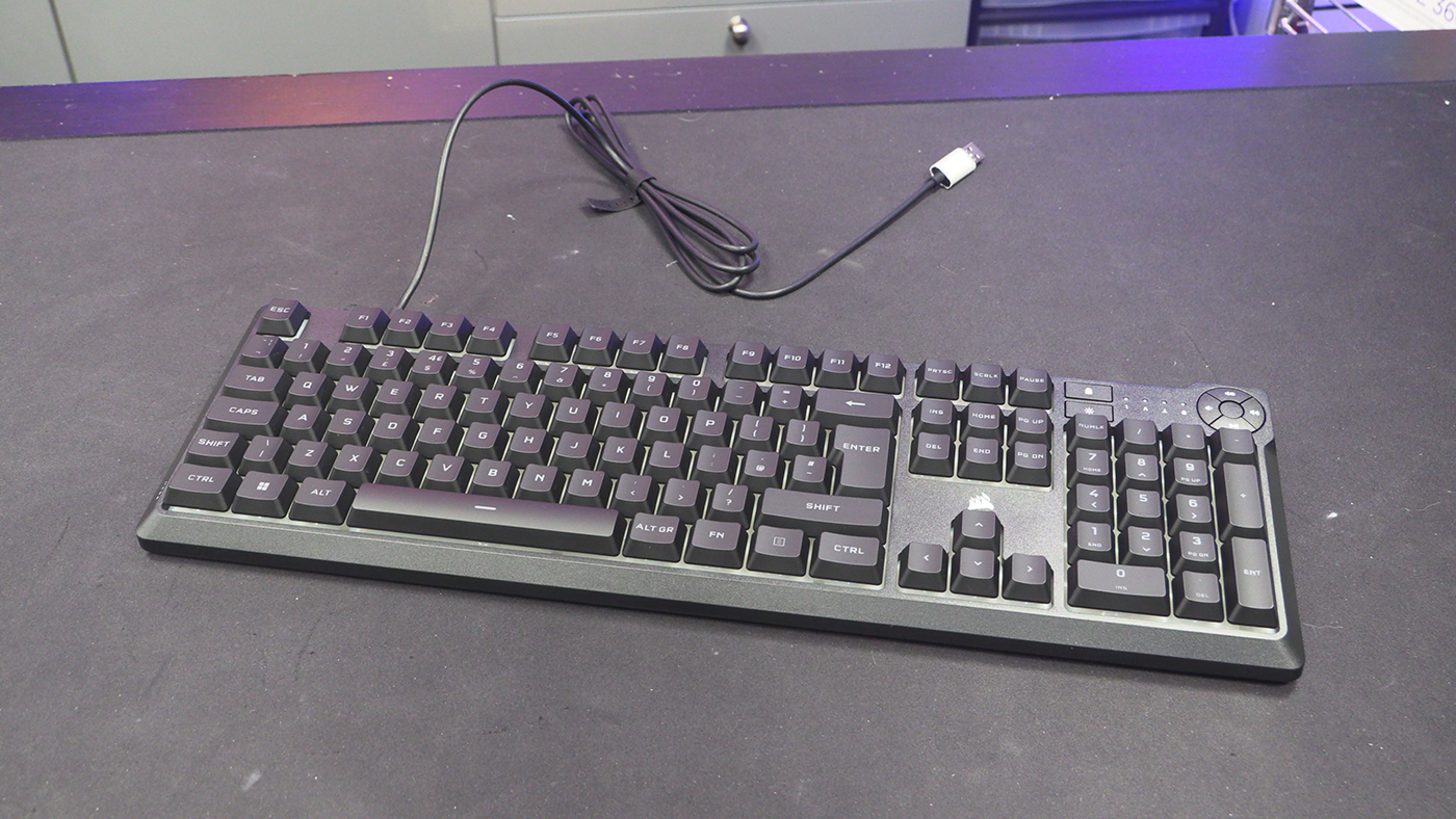
As a model very much at the affordable end of the Corsair range, the K55 Core is largely plastic. If you’re used to their aluminium-framed models it can come as a shock. However, as the boss uses a K55 as the every-day weapon, there is no-one better qualified to compare it to the OG K55.
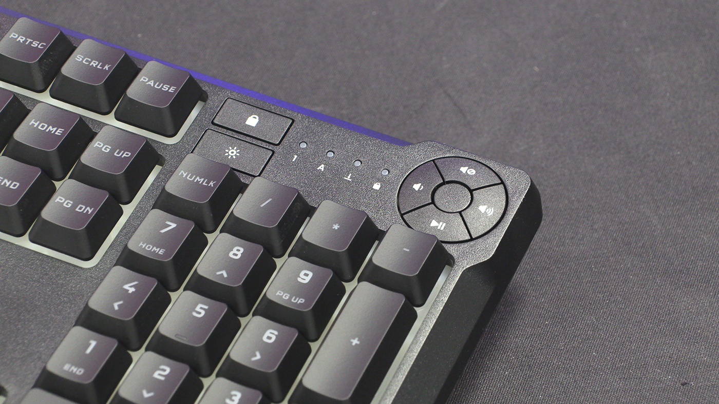
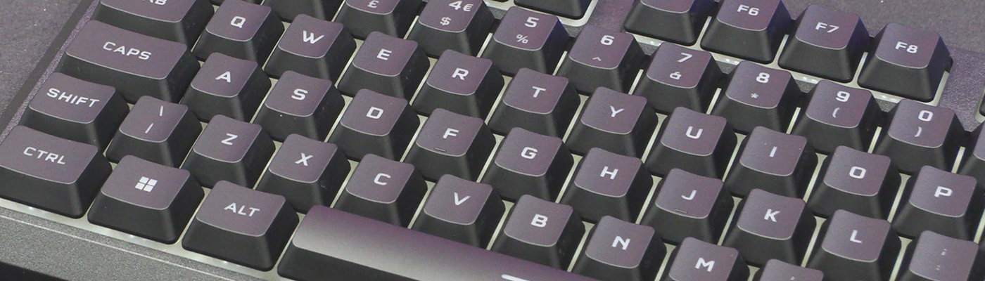
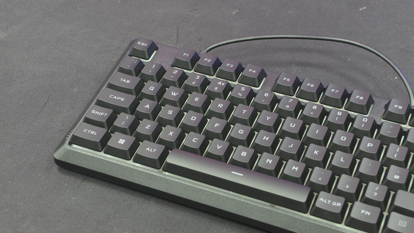
Certainly the font is crisp and clear. The RGB sits behind the keys rather than shining through them. Also, being a very affordable keyboard, the K55 Core has ten banded lighting zones. That’s instead of per key lighting on more expensive models. It’s very much expected at this price point though. We can think of a few off the top of our head that use this lighting style.
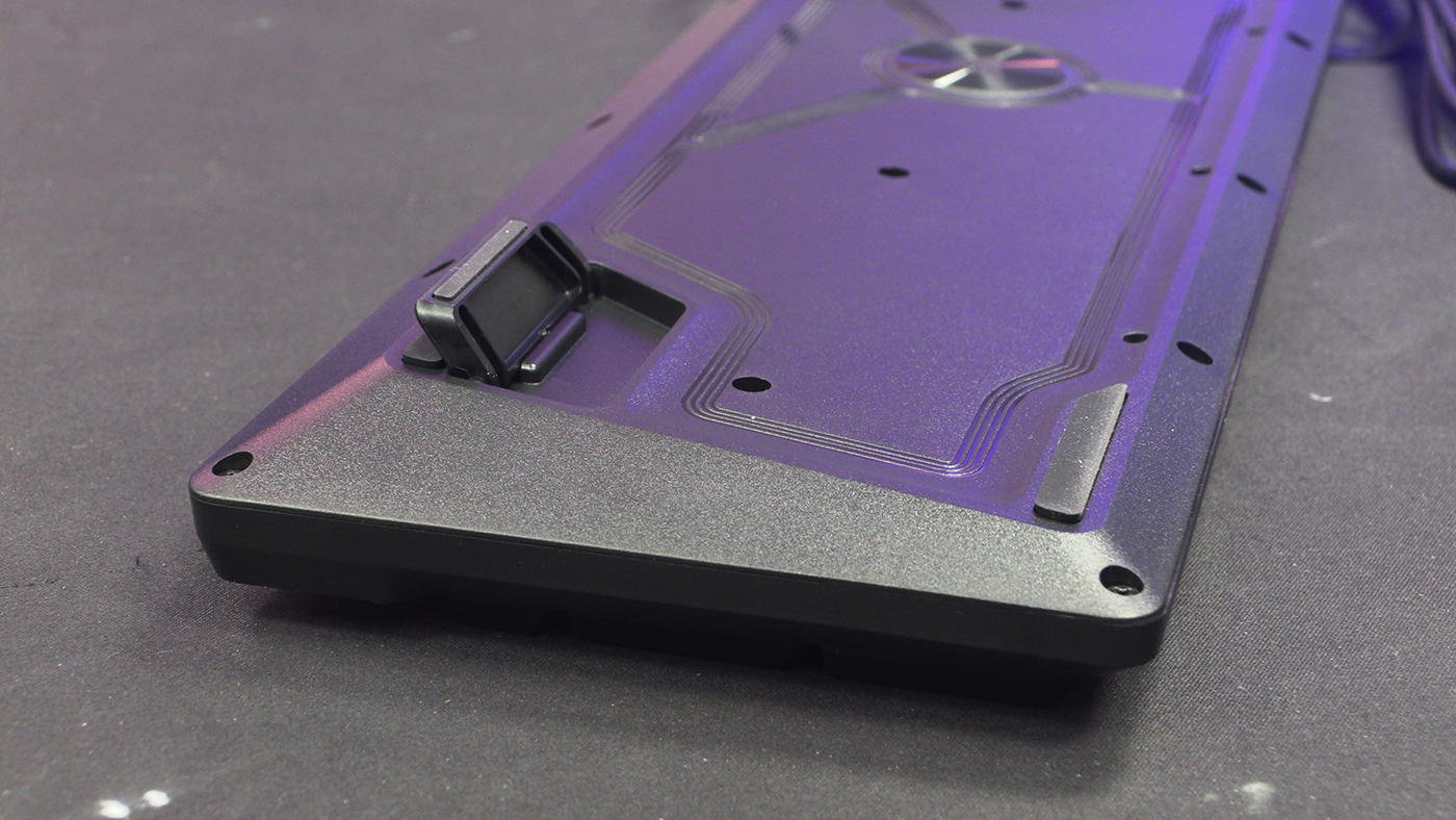
The feet on the underside are single height and quite stubby. It makes for a comfortable angle. Being so light the small feet aren’t an issue either. The holes in the back you can see are to let any spills out. The 300ml spill resistance just below the size of a full can. Nice.
The K55 Core has changed the media key design from the original. We’ll show you on the next page. Those of you with big sausage fingers need not apply. Or those who want to skip tracks.